Which do you like better

Signed-In Members Don't See This Ad
Status
Not open for further replies.

Old Griz

Passed Away Oct 4, 2013
In Memoriam
Joined
Mar 17, 2004
Messages
1,977
Location
Hagerstown, MD, USA.
Here are two versions of the same picture... the top has the background blurred a bit to make the pen look sharper and the bottom is the original as the camera took it...
BTW, lighting has been changed to 2 30 watt daylight balanced flourescent bulbs (http://store.tabletopstudio-store.com/spiral.html) I may upgrade to 3 lights to get better balance..
The upgrade in the lights made a big difference in the pics.. I also changed the background from an old pillowcase to a neutral gray piece of art paper and then the postcard design paper on top of that.. the neutral gray goes up the back and front (you can't see it in the cropped pic) and gives the camera's meter a more even exposure, and no hot bright reflections like you would get with white... So far so good... BTW, these were not taken inside the tupperware container.. but on top of the kitchen table with open lights... I think the flourescents cast less glare than the daylight incandescents did..
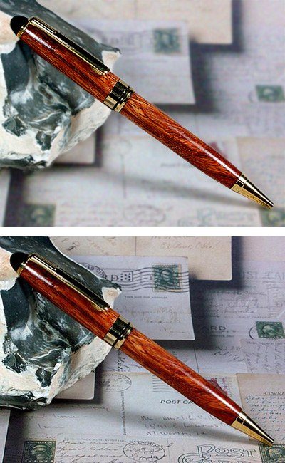
2005328131842_RedAfzelia.jpg
 
Signed-In Members Don't See This Ad
I like the top with the background blurred. It focuses (literally) all of my attention to the pen, and to me makes it look sharper, even though it is not. Nice pen too!
 
I also like the top- very nice. Have you played with a gradual depth of field change? Maybe make the area just underneath the pen and the rock by the pen in focus and have them fade out of focus as they get further from the pen? That way it would give the impression of an actual shot with an extremely tight depth of field. Just a thought. Great picture, though- in both cases :)
 
Good suggestion Nils.. thanks.. just have to figure out how to do that in Photoshop.. unfortunately the background is too close to do that with the digital camera... even shot at the most open aperture..
 
I agree with everone so far (a rare occassion), Tom. The top one is definitely more attractive than the bottom one. Now you've got me ready to try using flourescents without any diffusers... [;)]
 
I agree, number one is by far the best. If you want less DOF move the camera back a little, this will make the background more out of focus. I'm guessing you already know this but figured I'd say it for those that don't. [:D]
 
Tom,
I like the first one. The one thing I noticed was that I spent more time looking at the rock or metal or whatever trying to figure out what it was. It kinda took my attention away from the pen because it looks shiny to me.
 
I'll vote aginst the crowd on this one. With the exception of the slight shadow the first one looks like you took a picture of the pen and then inserted it on a stock background, almost fake looking to me. In fact it would be easier to take the photo on some unusual color, in video we use chromo-key green or blue, then use photoediting software to remove the background altogher. You could then place the pen on any background you want. Maybe I have worked with students too long doing digital magic on photos and video to trust any photo.

Now after all that, both are great photos. You defintitely take some of the best photos on here, it's an area I really need to improve on. I usually just lay stuff on the counter and snap away with my digital camera, and the difference in your photos to mine really shows the effort you put into it. Good job on both![8D]
 
I think that the top one looks good but it's a little artificial looking at the bottom where it is out of focus and should be because it falls into the same depth as the pen parts it is touching. I see you want to know how to fake the depth of field in PS... well here is how I do it. I duplicate the background layer, and I apply a box blur(to me it emulates bokeh better than gaussian blur) to the copied layer. I then add a "reveal all" layer mask to the copied blurred layer. Using the default black and white (black to hide the copied layer and white to reveal it) I use the gradiant fill tool and make it so white is on top and black is on bottom and and fill the layer mask frame with the gradiant (linear top to bottom) Making sure the transition point falls in the same place as the pen point... Then I switch to the paintbrush tool and I fill the pen and rock(whatever that is)in with pure black which hides the effect. The result is a pen and rock in sharp focus and the background blurs more the further it is away... and less as it is close. Look at the picture I posted to see what I'm talking about. :D


Originally posted by Old Griz
<br />Here are two versions of the same picture... the top has the background blurred a bit to make the pen look sharper and the bottom is the original as the camera took it...
BTW, lighting has been changed to 2 30 watt daylight balanced flourescent bulbs (http://store.tabletopstudio-store.com/spiral.html) I may upgrade to 3 lights to get better balance..
The upgrade in the lights made a big difference in the pics.. I also changed the background from an old pillowcase to a neutral gray piece of art paper and then the postcard design paper on top of that.. the neutral gray goes up the back and front (you can't see it in the cropped pic) and gives the camera's meter a more even exposure, and no hot bright reflections like you would get with white... So far so good... BTW, these were not taken inside the tupperware container.. but on top of the kitchen table with open lights... I think the flourescents cast less glare than the daylight incandescents did..
2005722214610_Afzelia.jpg
 
I like the second picture better. But either way I loose focus on the top of the pen with the black in the rock. Both are 50 times better than any pictures I have taken. Great job.
 
Status
Not open for further replies.
Back
Top Bottom