You are using an out of date browser. It may not display this or other websites correctly.
You should upgrade or use an alternative browser.
You should upgrade or use an alternative browser.
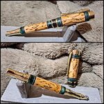
Not sure how I feel about this pen
- Thread starter Joebobber
- Start date
Signed-In Members Don't See This Ad
Signed-In Members Don't See This Ad
Painfullyslow
Member
It is definitely busy, but I don't think too busy. It is a lovely combination of materials and you should be proud to have made it. Well done!
Wmcullen
Member
It's a fun mix of materials. I see what you're asking: would less be more if you had a center band that was more in line with the other materials you've already introduced? Maybe. But I'm getting jealous of all these beautiful green pens made by talented turners like you and Ken!!


- Cullen
- Cullen
Joebobber
Member
Yeah I was laying here thinking about it and I think at minimum chrome would've been a much better look, or brass accent instead of aluminum.I can't decide, it's certainly not bad, but I'm thinking because the rest of the pen is gold with no other accents that maybe the aluminum doesn't fit, maybe brass would have been a better fit?
1080Wayne
Member
I like the blue cottonwood with the masur birch , but I think no cottonwood or aluminum on either side of the center band would have looked better .
jttheclockman
Member
I think it is the size of the end caps. Another way around that is to start with the blank central color and then add a band of the green. It breaks up the all green in the center. Many times this just comes down to taste and learning from what looks good and what may not. We learn from every pen we make. Keep at it you are doing fine.
Example of my thoughts.

Example of my thoughts.
Last edited:
mark james
IAP Collection, Curator
OK, now my brain hurts...
The pen as portrayed is excellent! But you asked for thoughts.
Tweaking? OK, so if the middle section was 'less busy' ( a very subjective term), it may play better with the bands. I am also drawn to (shudder) more trim rings...

 .
.
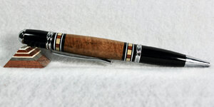
My thought: Smaller center sections, smaller green acrylic rings, add aluminum/black rings on the outside. Then a final ring with the center section material. I hope this makes sense. I'll add a photo of a general example. Ignore the segmented ring - yours are green solid. My thought is for the green ring to be between the middle section material on both sides.
The pen as portrayed is excellent! But you asked for thoughts.
Tweaking? OK, so if the middle section was 'less busy' ( a very subjective term), it may play better with the bands. I am also drawn to (shudder) more trim rings...
My thought: Smaller center sections, smaller green acrylic rings, add aluminum/black rings on the outside. Then a final ring with the center section material. I hope this makes sense. I'll add a photo of a general example. Ignore the segmented ring - yours are green solid. My thought is for the green ring to be between the middle section material on both sides.
Attachments
I like the combination of materials and don't dislike the pen. I agree with JT and Mark on reducing the center bands and/or moving them in a bit. Try different combinations, but don't give up on the segmenting combinations. I like your work. Thanks for sharing.
sorcerertd
Member
It is nice work and the blank/barrel elements work well together. I agree about the center band area, but wonder how it would look with the kit center band taken completely out. I also agree that it would work better in chrome.
Beautiful pen! I'm curious...did you make that blank yourself? Or was it something you bought? I really like that pinstripe look...I think it is the size of the end caps. Another way around that is to start with the blank central color and then add a band of the green. It breaks up the all green in the center. Many times this just comes down to taste and learning from what looks good and what may not. We learn from every pen we make. Keep at it you are doing fine.
Example of my thoughts.View attachment 331788
jttheclockman
Member
I made this. I make most all my own blanks. I could not find original thread on this but here is a description I put in my album.Beautiful pen! I'm curious...did you make that blank yourself? Or was it something you bought? I really like that pinstripe look...
https://www.penturners.org/media/copy-of-imgp0441-jpg.35185/
Last edited:
Joebobber
Member
I made a few like that myself. I actually won the Arizona Silhouette contest popular vote back in 2018 when I first started turning with a gold amboyna burl with african blackwood and aluminum from a pop can. I also did 1 in birdseye maple with the blackwood/aluminum and 1 in pink ivory and black/aluminum. Exactly the same as yours but yours looks to have thicker aluminum.I made this. I make most all my own blanks. I could not find original thread on this but here is a description I put in my album.
https://www.penturners.org/media/copy-of-imgp0441-jpg.35185/
Larryreitz
Member
I'm with those who suggest moving the segments away from the very end of the blank, much like the picture JT posted.
WriteON
Member
I think it's pretty cool
WriteON
Member
I like the blank choice and turning anatomy … I feel the kit & shaping go well together. Would leave as is and enjoy. Has a rare appearance. A one of a kind type.
sorcerertd
Member
The funny thing is that your post and this discussion have pretty much been all about the center section. When I first looked at this post, what I noticed right away was that the main barrel is straight, but the blank on the cap barrel was left wider and it looked a bit off balance. I still like it.
Joebobber
Member
Yeah I see what you're saying. When you look at the bottom picture the cap looks straight and not bigger, but it looks bigger on the top picture. The cap is a 31/64 tube and the body is a 25/64 but that wouldn't do it.The funny thing is that your post and this discussion have pretty much been all about the center section. When I first looked at this post, what I noticed right away was that the main barrel is straight, but the blank on the cap barrel was left wider and it looked a bit off balance. I still like it.
sorcerertd
Member
BTW, that comment wasn't to nitpick, but just to say the center wasn't the first thing that I noticed. Had you not mentioned anything about the center band area, I might not have noticed it that much. But then, I do look at things differently sometimes. One thing I love about IAP though, is that I can get so much feedback from different views. When I look at someone's work, it is with the thought of "If I had made this, what would I want to improve on", based on my own personal taste, of course. In the end, we are probably all our own worst critics (I know I am).Yeah I see what you're saying. When you look at the bottom picture the cap looks straight and not bigger, but it looks bigger on the top picture. The cap is a 31/64 tube and the body is a 25/64 but that wouldn't do it.
Joebobber
Member
No I didn't take it as nitpicking. I asked for thoughts so it's not like you are messaging me and giving me unsolicited advice on something you think I should do to make my pens look more like your pens. That has actually happened to me here and I am grateful for you taking the time to reply honestly to my post. I really do appreciate it.BTW, that comment wasn't to nitpick, but just to say the center wasn't the first thing that I noticed. Had you not mentioned anything about the center band area, I might not have noticed it that much. But then, I do look at things differently sometimes. One thing I love about IAP though, is that I can get so much feedback from different views. When I look at someone's work, it is with the thought of "If I had made this, what would I want to improve on", based on my own personal taste, of course. In the end, we are probably all our own worst critics (I know I am).


