
You are using an out of date browser. It may not display this or other websites correctly.
You should upgrade or use an alternative browser.
You should upgrade or use an alternative browser.
Last chance to say my cards look bad
- Thread starter davinci27
- Start date
Signed-In Members Don't See This Ad

Signed-In Members Don't See This Ad
nava1uni
Member
I like the care, but find the writing turned on its side is difficult to read. I would make the writing horizontal for the comfort of the reader. Otherwise people won't keep them.
Fred
Member
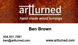
Ben ... IMHO I think there is too much 'white space.
Make your card easier to read and that way more folks will read it. The initial design is alright, but you have to turn it on end to actually read it. People don't want to really have to go through the motions of turning, twisting, etc.
A business card is for attracting business or to announce your name to a potential client or to keep it available. DO just that and nothing more. Use the KISS principal and then let them ask questions.
At least turn your logo - nice one at that - and make it fill the card left to right. Put your second line underneath and scale the length to be under the company name (left to right). Make the font large enough that people can read the information with no strain on their part. You can keep the neat background as well and cover the entire card with it. Just scale your words to be clear to the reader.")
Make your card easier to read and that way more folks will read it. The initial design is alright, but you have to turn it on end to actually read it. People don't want to really have to go through the motions of turning, twisting, etc.
A business card is for attracting business or to announce your name to a potential client or to keep it available. DO just that and nothing more. Use the KISS principal and then let them ask questions.
At least turn your logo - nice one at that - and make it fill the card left to right. Put your second line underneath and scale the length to be under the company name (left to right). Make the font large enough that people can read the information with no strain on their part. You can keep the neat background as well and cover the entire card with it. Just scale your words to be clear to the reader.
jkeithrussell
Member
- Joined
- Oct 20, 2008
- Messages
- 1,277
Unless I'm missing something, it's a front and back card.
I love it, and I hope you keep it just the way that it is.
I love it, and I hope you keep it just the way that it is.
S
spiritwoodturner
Guest
Hey Ben,
If it's a front and back, I like it. If that's the whole front I really don't. This is only personal opinion, and what do I know, but the name "Artturned" doesn't roll off the tongue to me. One T may have been catchier, but you've likely gone to the trouble to lock up your domain, and that's a lot of work, I know. It won't stop people from buying from your website, I just wonder if people will remember it after a show. Just a rambling thought, and what you think is more important anyway. But you asked, so there ya go!
The whole marketing thing is way more art than science, so I doubt there's a right or wrong answer here. Just wish you the best of luck!
Dale
Russianwolf
Member
I agree about the white space. With only three pieces of info on the card, it's overwhelming.
If it were me, I'd go with something like this with only that info.
My cards are completely white (background-wise) but the way the info is laid out, makes it less overwhelming to me at least. I'll attach what mine looks like roughly (I made them in Word and print them myself at this point)
If it were me, I'd go with something like this with only that info.
My cards are completely white (background-wise) but the way the info is laid out, makes it less overwhelming to me at least. I'll attach what mine looks like roughly (I made them in Word and print them myself at this point)
Attachments


Last edited:
davinci27
Member
Thanks for the comments. Yeah, my wife wasn't a big fan of the name artturned but it works for me. I've asked many many people and overall the opinion I got was that the logo on the side was more "flashy," but didnt' really highlight any of the information well. I revamped a little and this is what I've got.
I've always worked in artsy places. All my business cards were over designed and meant to be as different from other business cards as possible. For selling pens and such I guess you want to be more functional.
I've always worked in artsy places. All my business cards were over designed and meant to be as different from other business cards as possible. For selling pens and such I guess you want to be more functional.
Attachments
edman2
Local Chapter Leader
I like this version better. You dun good!
Thanks for the comments. Yeah, my wife wasn't a big fan of the name artturned but it works for me. I've asked many many people and overall the opinion I got was that the logo on the side was more "flashy," but didnt' really highlight any of the information well. I revamped a little and this is what I've got.
I've always worked in artsy places. All my business cards were over designed and meant to be as different from other business cards as possible. For selling pens and such I guess you want to be more functional.
S
spiritwoodturner
Guest
I like that better, Ben. I have to redo mine too, I'll give you a crack at mine! Business cards are tough-so little room, so much message to convey. It's simple when you work for GE or the like: name, rank, serial number. But we're trying to get a "feel" out, and that ain't easy. I hate my current ones. Are you having a local printer print them? And handing him the completed setup? Just curious, because I really need to do the same thing.
Dale
Dale
jkeithrussell
Member
- Joined
- Oct 20, 2008
- Messages
- 1,277
Not to beat it into the ground, but I liked it better the first time (at least with the impression that the name/number were on the back). Now you have 2 totally different types of layouts, color schemes, and fonts on the face of one small card.
If it were me, I would at a minimum incorporate the contact information in the same format and color scheme as the rest of the card. The red/orange looks good.
A lot of corporate business cards are 2-sided. The front side is generally sleek and clean (like yours was in the original post), and the details are on the back.
davinci27
Member
It's always been just one side. The original just had the logo on the right hand side. I always like business cards that are one sided. I like to make notes and things on the back. I've done 2 sided cards in the past but just didn't like them.
To be honest, I'm not really trying to sale any pens. I don't really have time to work fairs at the moment. I'm only printing cards so that on those few occasions somebody asks to buy one I'll have a card to go with it. If I ever start doing fairs and such, I'll probably re-design the cards.
Thanks
To be honest, I'm not really trying to sale any pens. I don't really have time to work fairs at the moment. I'm only printing cards so that on those few occasions somebody asks to buy one I'll have a card to go with it. If I ever start doing fairs and such, I'll probably re-design the cards.
Thanks
ed4copies
Local Chapter Manager
Ben,
I believe the majority of the cards I have given away at shows are still in the ladies' purses. Down at the bottom, under the lipstick color she stopped using in 1990.
Personally, I like the second one better, but I would say make them off a color printer for a while. IF you find one you REALLY LOVE, then have it printed.
(I AM CHEAP!!)
Texatdurango
Member
The idea of a card is to quickly put someone in touch with you when they think of buying a pen for themselves or someone else. Chances are it is among a dozen or so other business cards so the key is to make it easily recognizable and memorable, not necessarily flashy or tricky. In my opinion having the burl cover most of the card definately will show that it's a wood related card. I have a photo of a pen on mine so it can easily be identified as a penturners card.
Ankrom Exotics
Member
I like both versions with the latest revision winning by a nose.
BLLEHMAN
Member
I like the second one better. I am also cheap but I find that I can get them printed from an online source cheaper than if I tried to print them myself. They also look better and the ink doesn't smudge. If you don't mind the printing company's logo on the back, you can get 250 cards for free + shipping. They also charge a fee to upload your own logo but its just a one time charge.
OldWrangler
Member
Nice card but how come so many people have no address on their cards. Some people sent me cards that didn't have any contact info on it ...no email or phone #. The purpose of a card is to get people to contact you. I give them out to everyone and ocassionally one comes back in with an order.
So send me one for the drawing....some nice prizes.
Kathy made my cards on some computer program using card stuff from Office Depot. They suit me fine. They are printed on both sides.....take a look.
So send me one for the drawing....some nice prizes.
Kathy made my cards on some computer program using card stuff from Office Depot. They suit me fine. They are printed on both sides.....take a look.
Attachments
![IMG_2403[1].jpg](/data/attachments/7/7279-7471abb10ddf494f59602aebe12abc82.jpg)
![IMG_2404[1].jpg](/data/attachments/7/7281-12cf43fd36d2c1be41606d7eb0132bd7.jpg)
keithkarl2007
Member
I'd use the first one and use images of pens and/or other items in the white space
ed4copies
Local Chapter Manager
George,
We don't put an address on, cause we don't want "drop in" visitors!!
E-mail, website or phone - DON"T stop by!! We could be "cookin polyresin", which some people think, stinks!!
We don't put an address on, cause we don't want "drop in" visitors!!
E-mail, website or phone - DON"T stop by!! We could be "cookin polyresin", which some people think, stinks!!
randyrls
Member
George,
We don't put an address on, cause we don't want "drop in" visitors!!
E-mail, website or phone - DON"T stop by!! We could be "cookin polyresin", which some people think, stinks!!
Or just cookin' ?????
As an aside, check the 2 sided printing before attempting it. Some cards can be printed on both sides, some cannot.
nava1uni
Member
I like the second version. Clean, but artsy.
Russianwolf
Member
if I were a store or office, I would include an address, since I'm neither, They just get the city so they know where abouts I am working. If they really wanted, I'm listed in the book by the same name, but the more important info is Website, phone and email.