Brooks803
Member
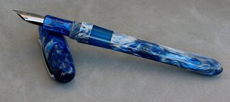
This was originally a custom order from a customer of mine that in the end he just didn't like. He thought he wanted an ink window on the pen, but when he saw it he thought it looked "off". So I offered to remake the pen body without a window and he loved it (see that pen here: http://www.penturners.org/forum/f13/recent-commission-127296/).
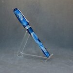
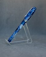
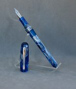
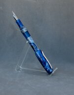
So here's the "reject". I went ahead and finished out the pen for inventory.
Dimensions:
Capped: 6" ~ 152mm
Cap: 2 1/4" ~ 57mm
Body: 3 7/8" ~ 98mm
Body & Nib: 5 1/2" ~ 140mm
Posted: 6 1/4" ~ 159mm
Threads:
Cap/Body: 12x.08mm triple start
Body/Section: 10x1mm
Nib & Ink:
#6 Polished Steel Jowo - B
Cartridge/Converter/Eyedropper


Thanks for looking!
So here's the "reject". I went ahead and finished out the pen for inventory.
Dimensions:
Capped: 6" ~ 152mm
Cap: 2 1/4" ~ 57mm
Body: 3 7/8" ~ 98mm
Body & Nib: 5 1/2" ~ 140mm
Posted: 6 1/4" ~ 159mm
Threads:
Cap/Body: 12x.08mm triple start
Body/Section: 10x1mm
Nib & Ink:
#6 Polished Steel Jowo - B
Cartridge/Converter/Eyedropper


Thanks for looking!
