You are using an out of date browser. It may not display this or other websites correctly.
You should upgrade or use an alternative browser.
You should upgrade or use an alternative browser.
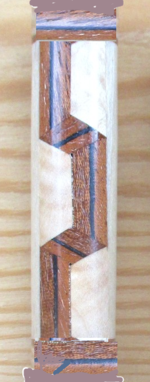
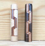
Advice please. With caps or without?
- Thread starter Alan Morrison
- Start date
Signed-In Members Don't See This Ad
Signed-In Members Don't See This Ad
jttheclockman
Member
Not sure what you are asking. Now this is just an eye thing and opinion. I think if the center line was carried around the same pattern it would look better. But I do get what you were after with the breaking up of the center line. It works.
JohnU
Member
I like it without the caps. Being able to see more ribbon.
ed4copies
Local Chapter Manager
If this is a single-barrel pen, I would use much shorter caps--maybe 1/8" (prox 5 mm).
This would "finish off" the look as it transitions to hardware and yet show as much of the
pattern as feasible.
FWIW,
Ed
This would "finish off" the look as it transitions to hardware and yet show as much of the
pattern as feasible.
FWIW,
Ed
Larryreitz
Member
Just my opinion, but, I prefer this one without caps.
Larry
Larry
I actually like both. The long ribbons with the darker background works really well for that combination. That caps work well with the lighter combo. I do agree with Ed that shorter caps might be better. If I had to pick one option, I would go with no caps.
You might also consider continuing the no cap design to the body of the pen (as long as everything lines up.) That would be a real striking design. Well done. Thank you for sharing.
You might also consider continuing the no cap design to the body of the pen (as long as everything lines up.) That would be a real striking design. Well done. Thank you for sharing.
MRDucks2
Member
I like the one without caps much better. The caps are bulky and take away from the look of the pattern. As such, Ed's suggestion of a much thinner cap may make a difference.
leehljp
Member Liaison
Without Caps as a blank looks better to me too, however, I do know that looks often change when mounted in a pen, and with the right color pen choice ( Gold Chrome, Silver, Brass, Copper,) the light colored capped one might outshine the uncapped one.
walshjp17
Member
Based on the two samples presented, I prefer the one without caps. That said, as Ed noted, smaller caps might be a good option.
Paul in OKC
Member
I like caps, but would consider smaller (thinner) ones.
Lew
Member
They are both beautiful, great pieces. But I like without caps better. As Lee says, though, it depends on what the finished product looks like. It would be interesting to see how they both wind up.
Kenny Durrant
Member
Wow! Did you get you question answered? Just in case you didn't I'll add my 2 cents. I like both blanks but I'd prefer the caps. Also I like the ribbon on the right better than the left. I can see cutting away the nicer ribbon for caps would be a tough call but like Ed I think it would flow better with the kit. So if I was to reconstruct the two I'd use the ribbon on the right with very thin end caps. IMHO
mark james
IAP Collection, Curator
I'm usually a cap person, but for these designs I'll take the ribbons as long as possible. Those are really nice Alan. 


Humongous
Member
I vote for no caps. It lets the ribbon standout.
howsitwork
Member
Sorry I know I am in the minority but i like the lighter one for a single barrel pen.
Narrower caps would work with the right hand darker colours but they finish the flow off to my eyes otherwise the ribbon goes no where.
Narrower caps would work with the right hand darker colours but they finish the flow off to my eyes otherwise the ribbon goes no where.
jttheclockman
Member
Have to say all my time on this site and never heard the phrase caps used for trim rings. Excuse my confusion. Yes either way works well but if doing a 2 piece pen Then definetly caps as you call them work better because it breaks up that line and trying to line up designs from cap to body of a pen is tough to do. If a single barrel pen then either way works but agree with others, thinner "Caps" look better.
sorcerertd
Member
For starters, that's a very nice design! What about a small frame instead of a full cap like that? Something like the divider between the design and the cap without the cap. Or like Ed said, a much smaller cap. That or...
You obviously like challenges so how about this, make the ribbon curl at the ends and wrap around to tuck under the existing end of the ribbon? I tried to photoshop (gimp), what I picture in my mind but it's a pretty crude representation. Hopefully this gives a rough enough idea of what I meant. I don't know for sure how you would curl/fold it into those bands, but there is the challenge, right?

You obviously like challenges so how about this, make the ribbon curl at the ends and wrap around to tuck under the existing end of the ribbon? I tried to photoshop (gimp), what I picture in my mind but it's a pretty crude representation. Hopefully this gives a rough enough idea of what I meant. I don't know for sure how you would curl/fold it into those bands, but there is the challenge, right?

Alan Morrison
Member
Thanks for the comments, Ed. I think that my next attempt will be on a longer tube, eg. a Knurl, which will allow me the longer ribbon with the 2 'folds' in it as well as the end rings.If this is a single-barrel pen, I would use much shorter caps--maybe 1/8" (prox 5 mm).
This would "finish off" the look as it transitions to hardware and yet show as much of the
pattern as feasible.
FWIW,
Ed
These were a couple of 'suck it and see' prototypes. I had tried shortening the long parts of the ribbon between the folds but it didnt look right.
Alan
Alan Morrison
Member
Me too.Just my opinion, but, I prefer this one without caps.
Larry
Alan Morrison
Member
Thanks Hank. I prefer the blank without the ends as well though my reservation re. the other one is that the ribbon has only one 'fold' in it. I tried shortening the length of the ribbon between the folds but it doesnt look right. A longer tube should sort that out.Without Caps as a blank looks better to me too, however, I do know that looks often change when mounted in a pen, and with the right color pen choice ( Gold Chrome, Silver, Brass, Copper,) the light colored capped one might outshine the uncapped one.
Alan
Alan Morrison
Member
Thanks for the comments, Lew. I prefer also the colours of the one without the end caps.They are both beautiful, great pieces. But I like without caps better. As Lee says, though, it depends on what the finished product looks like. It would be interesting to see how they both wind up.
Alan Morrison
Member
Thanks for your input, Kenny. As I said to Ed above I think that a longer tube will solve the issue.Wow! Did you get you question answered? Just in case you didn't I'll add my 2 cents. I like both blanks but I'd prefer the caps. Also I like the ribbon on the right better than the left. I can see cutting away the nicer ribbon for caps would be a tough call but like Ed I think it would flow better with the kit. So if I was to reconstruct the two I'd use the ribbon on the right with very thin end caps. IMHO
Alan Morrison
Member
Thanks, Mark. I normally use caps as well, given that I have had a couple of blanks split when drilling ones without them.I'm usually a cap person, but for these designs I'll take the ribbons as long as possible. Those are really nice Alan.


Alan
Alan Morrison
Member
Sorry for the confusion, John. I should have called them trim rings. ( what do I know???)Have to say all my time on this site and never heard the phrase caps used for trim rings.Excuse my confusion. Yes either way works well but if doing a 2 piece pen Then definetly caps as you call them work better because it breaks up that line and trying to line up designs from cap to body of a pen is tough to do. If a single barrel pen then either way works but agree with others, thinner "Caps" look better.
These were for single barrel pens. I will post a photograph later.
Alan
Alan Morrison
Member
Challenge accepted, Todd.You obviously like challenges so how about this, make the ribbon curl at the ends and wrap around to tuck under the existing end of the ribbon? I tried to photoshop (gimp), what I picture in my mind but it's a pretty crude representation. Hopefully this gives a rough enough idea of what I meant. I don't know for sure how you would curl/fold it into those bands, but there is the challenge, right?
Thanks for the comments.
Alan
MedWoodWorx
Member
no cap pleaseUsing caps means loosing a lot of ribbon.
Which is better?View attachment 337875
sorcerertd
Member
Did someone say caps?


