PatrickR
Member
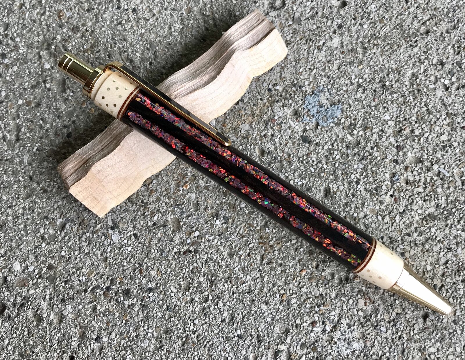
My second attempt and I think it is much better. Holly bands, mahogany/maple/mahogany veneer, ebony, cats eye opal (med size) and 60 brass dots.
C&C welcome.

C&C welcome.
I can see that. Do you think less channels (6 now) or thinner ones?Nice work but a bit too much opal for me
I have done the step on a number of these but always very narrow and they are barely noticeabl. On this one i made it wider to match the distance from the dots to the edge on the body side. If done over I would have made it narrower.I agree that they are both very nice, but this really stands out. I love the dots as an added element on this one, too. In my opinion, what I would change would be to somehow smooth the hard angled "step" at the top and to make the opal grooves a little narrower. (That is, if I had the skills to do this to begin with.) That's some awesome work, though!
Smaller channels, fewer and thinner.I can see that. Do you think less channels (6 now) or thinner ones?
Interesting. I was going for basically equal widths wood/opal.Smaller channels, fewer and thinner.
Sometimes less is more. I might even think about some curves and small staggered inlay spots. Just some thoughts. I cut mine freehand with a Dremel tool. The last pen I did with some UV resin. looks decent.Interesting. I was going for basically equal widths wood/opal.
I do agree with the idea and have made more than a few blanks that I thought would be great but in reality ended up as too much, no focal point. This one I don't have that problem with. To each his own. I like a symmetrical balanced design that flows with the pen.Sometimes less is more. I might even think about some curves and small staggered inlay spots. Just some thoughts. I cut mine freehand with a Dremel tool. The last pen I did with some UV resin. looks decent.
Thanks!Oh that's bloody magnificent!
