Two fold pist

Signed-In Members Don't See This Ad
See more from KenB259

KenB259

Member
Joined
Dec 24, 2017
Messages
3,951
Location
Michigan
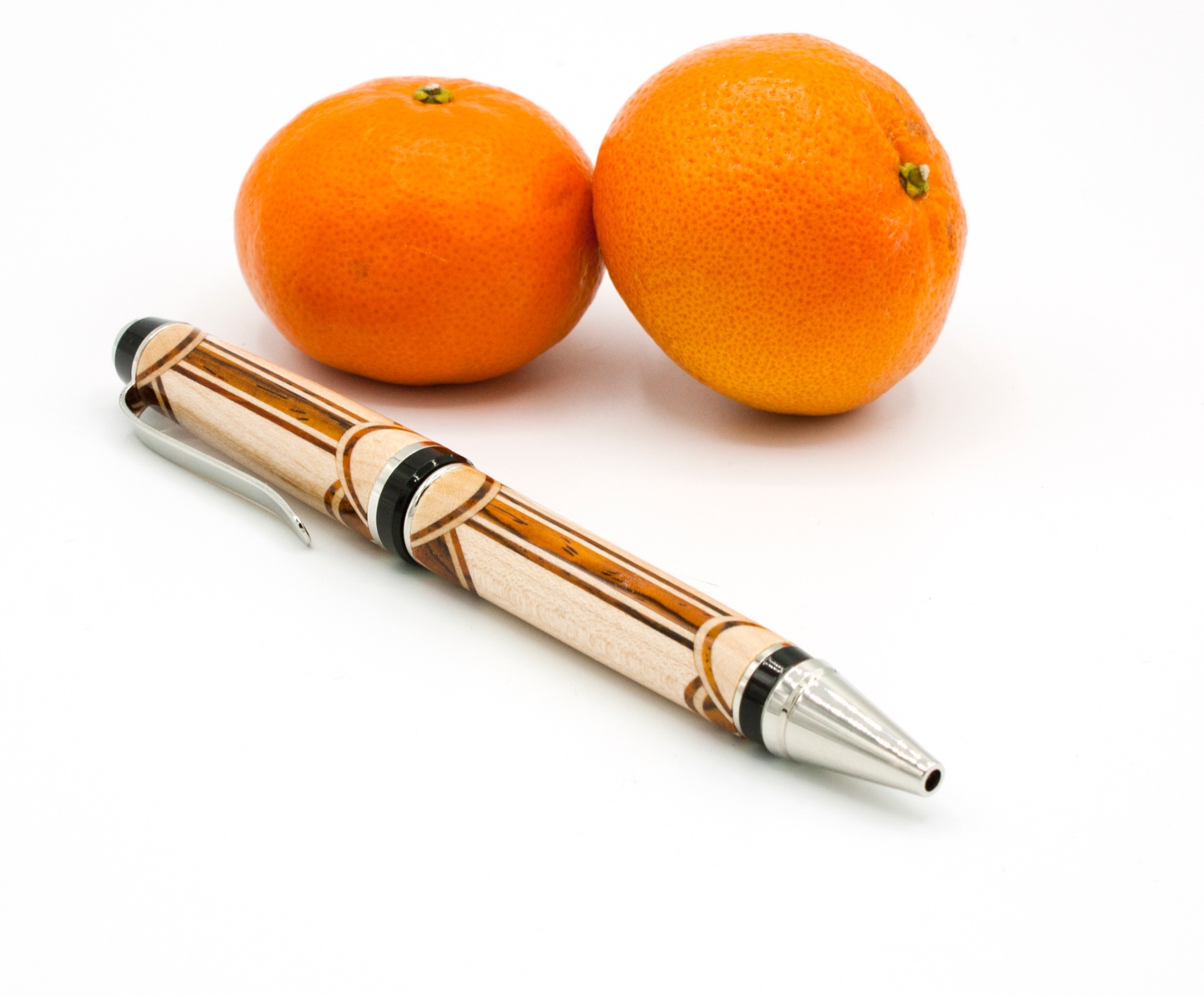
1st, since the segmented pen contest is completed, this was one of mine that I was considering entering. The main reason for this post is the photography. This was my first attempt at shooting a photo in RAW mode. In my opinion, this is the best pen photo I've taken. What are your opinions on the quality of this photo. Be honest, I want to get better at this. I know images look different on different devices. Post , not pist typo.
Image1614039892.512206.jpg


Sent from my iPhone using Penturners.org mobile app
 
Signed-In Members Don't See This Ad
I think the photo looks great. I too am trying to up my photography skills. So I will be interested to see what others say. Did you use a light box? Can you share any other specifics about your camera setting?


Sent from my iPhone using Penturners.org mobile app
 
Yes I used a light box that I bought awhile ago. Canon Rebel camera, an older one, probably bought the camera 10 years ago , so it's not the latest and greatest, but it does a good job. I'm kicking myself for not trying RAW before.


Sent from my iPhone using Penturners.org mobile app
 
Ken, the photos I received from you for the Segmenting Contest were excellent. Very well done in all respects, and better than average for those sent.

As for the photo above. I am curious if the wide middle strip is Padauk. From the grain pattern, it looks so, and then the colors should be more reddish than orange, IMO. It also looks a bit 'bright (slightly).' The clarity/focus (?) from the nib to the finial is excellent with little degradation, so that is good. (I wish I knew the proper photography terms of what I am describing; field of vision ???).

I would say the photo above is well done.
 
The woods are cocobolo and maple, no padauk. The colors in the photo look exactly like the woods. Perhaps the orange color of the mandarins sways your perception. Is that possible?


Sent from my iPhone using Penturners.org mobile app
 
I use a Canon Rebel T2i. Bought used about 2013. Older, but more excellent features than I have learned to use (Kind of like my Skew 🤣).

The IAP Library has extensive photography tutorials from Sylvanite, a superb photographer (and a much unrecognized penturner) - I highly recommend his thoughts.
 
I use a Canon Rebel T2i. Bought used about 2013. Older, but more excellent features than I have learned to use (Kind of like my Skew 🤣).

The IAP Library has extensive photography tutorials from Sylvanite, a superb photographer (and a much unrecognized penturner) - I highly recommend his thoughts.
Thanks for that link. I read through it,very informative.
 
Yes Eric is the man when it comes to photos and use of tent or not. To the photo looks good. What angle did you make the scallops?? Personally I would lose the oranges.
 
I like the photo. Especially how it captures the shadows on the white surface (almost like a reflection with no glare.) Very vivid colors and details from the pen. I too am curious about the angles of the scallops.
 
So I just checked this post on my work computer and it is a little brighter than what I see on my home computer and my phone. That's one of the issues with digital images, they don't look the same on all devices. All in all though I'm happy with my results shooting in RAW mode and then post processing. Thanks all for your input.
 
I'll second Eric's skills. A few years ago he did an excellent demo at the MAPG. While much was over my head, one thing that stuck in my mind was the perspective. I believe he showed the difference in looks when being too close and too far from the pen and when it was right it looked good. Maybe it was related to zoom as well. In this photo, I think the nib is too large relative to the finial. Still a nice photo and better than I could do. Nice pen too.

I would also lose the oranges.
Thanks for the input. I think was too close, after reading Eric's tutorial, I want to try it back a little farther.
 
Great pens and using the light box as worked well. Photography as been a hobby of mine for years both digital and film i got rid of my colour darkroom with advent of digital. Unfortunately I loaned my digital cameras to a friend to take to Spain just before our first Lockdown and they are still at is apartment in Spain and are likely to be there for some time so presently I'm stuck with my Samsung basic smart phone.
Good luck with your photography and your pens are great.
We could have a long debate on RAW files but not really for this forum.
 
Ken,

Your photo is better than 95% of the pen pictures posted on the IAP forum, so you're doing quite well already. You've used a light tent very effectively to achieve even illumination of the convex metal parts. The depth-of-field fully encompasses the pen. The exposure, white balance, contrast, and color saturation are good. Well done.

That said, I think (and this is just my opinion - some might disagree) that it could be even better. I agree with the prior comments that the oranges do not add to the photo. To my mind, they draw attention away from the pen. Unless you are trying to make a joke about the pen being "orange", I would remove them. Also (as noted already) the nosecone looks disproportionally large compared to the finial. This is caused by the distance between the pen and the camera. I'm guessing that you took the photo from about 12-18 inches away. I think you'd get more normal looking perspective if you moved back to 24-36 inches and zoomed in to frame the photo. The pen is resting on the clip. Unless your goal was specifically to show off the stripe segmentations, I think the pen would look better if the clip was more upright (but not fully so) so that the picture showed the front of the clip rather than the underside. Your key (primary) light appears to be directly overhead. Placing that light somewhat to the side and front (or back) would yield more dramatic and interesting shadows. I think that the pen might also look better if the refill were extended. There are no specular highlights on the wood - does this pen have a satin finish? If it has a gloss finish, you may want to place a light that produces a "shine line". I also note that the specular highlights on the nosecone and black trim ring look blotchy - as if the parts had a wavy surface or as if you used a LED strip light. That can be fixed with careful shaping of the light, or spot editing in post.

You're getting good results using RAW mode, but do you know how it actually works? Take a look at https://www.penturners.org/threads/what-is-raw-mode.115268/ and https://www.penturners.org/threads/pen-photography-myths.154777/#post-1979949 if you're interested in what RAW mode does (and doesn't do) for you.

Keep up the good work!
Eric

Eric, thank you so much for your comments. Pretty much all your assumptions were correct. Some if your suggestions I don't know how to do. The tent I have does have led lights, they are fixed in place at top, all I can do is adjust their brightness. The pen does have a glossy finish, I have never been able to show that in my photos.


Sent from my iPhone using Penturners.org mobile app
 
The tent I have does have led lights, they are fixed in place at top, all I can do is adjust their brightness.
Ken,

Does your light tent have translucent walls? If so, you could turn off the internal LEDs and light it from the outside. You want external lights to illuminate the tent walls, and the tent walls to illuminate the pen. That way, you have control over the shadows and highlights.

[rant on]
I've said this before on other threads, but it baffles me that light tents are made with integrated lights. Putting lights on the inside (especially an array of LEDs in a fixed location) defeats the purpose of the light tent.
  1. If the object you're photographing has reflective surfaces (especially convex ones such as a pen nosecone), then you can't control the specular highlights from the internal lights.
  2. If the object you're photographing does not have reflective surfaces, then you don't need a light tent in the first place.
A $25.00 translucent pop-up light tent and 2-3 external light bulbs will do a far better job.
[rant off]

Apologies for the rant,
Eric

No apologies necessary. No the tent I have does not have translucent walls. It has a ring of led lights at the top that I can turn the brightness up it down. And at the top , in the middle of the light there is a hole with a flap over it. I'll try to find a picture of it.


Sent from my iPhone using Penturners.org mobile app
 
I agree with Eric and appreciate the way he explained it.

To be direct can and does turn people off - and I can be that way at times, :rolleyes: but one issue that often comes up - is trying to make the photo look interesting. When photographing pens, the pen should to be the center of attention. The pen is what one is trying to show off - after all. Usually, USUALLY busy backgrounds distract. Once in a blue moon, there is a particular background that goes well with pens being shown. I don't remember which one but one of the front page pens recently had a background with quite a bit of detail, but it worked well with the pens. By and large, if anything is in the background or to the side, it should not detract from the showcased pen. To show off a pen, it is not about how interesting of a picture can be made with a pen in it. The pen should be the photograph. Accents "can" help, but should not distract. In Ball Room dancing, the man is there to showcase the woman - to bring attention to the woman, not distract from her and draw attention to himself. Accents should be that at best.

Background colors: I am not an expert on this as I can't tell "WHY" for specific background colors, but when I see background colors, I know if it is too dark, too light or too bright. In general, red backgrounds do not compliment most pens, yet many people seem to like red as a background. Red backgrounds tend to absorb the color from the pen (my opinion). Not sure if that is the correct way to say it but it is something along those lines. Black pens on black backgrounds tend to do similar - it is almost like there cannot be enough light to see the pen. Black on black makes for subtle shades and beautiful pictures, but it does not showcase the pen.

This is not about expert photography. It is about asking one's self questions at to what they are seeing or not seeing - to arrive at the best scenario to show off the beauty of a pen just made. Nothing wrong with that.

This next illustration can apply to finishing the pen and the photography of it. I used to make pieces of furniture (flat work) and often take 20 to 40+ hours to make it, and then spend 2 to 4 hours finishing. It took me about 20 years to learn that I needed to spend at least half as much time on the finish as I spent on making the piece of furniture. A good finish showcased the fine craftsmanship, whereas a lackluster and short changed finish diminished the beauty of the wood.

A good finish and a good photograph is what shows off the skill of the maker and the beauty of the object made.
 
Last edited:
Back
Top Bottom